Case Study: Neutral colours for a holiday home
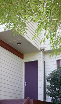
entrance
The modern day buzzwords of eco sustainability are now firmly entrenched in day to day living and designers are often asked to create designs which integrate well with the natural environment. When considering the environment it is the colour green which is often evoked, however another palette which is completely at one with nature is the natural palette. A beautifully serene neutral scheme can be created with the coastal hues of driftwood, rope, pebbles, sand, oysters and chalk. Rather than any strong colour taking centre stage it is the natural elements of these items that bring texture and interest to the scheme and in fact the addition of any other colour in this palette would detract from the natural calming beauty of the scheme.
Clients who own a weatherboard home at Killcare Heights were perfect candidates for this type of scheme. The home is used as a weekender to escape the pressures of city life and therefore it was essential to create an environment that was upmarket and chic but that appeared understated and above all relaxing. The natural palette was an obvious solution as it is simple and also at one with nature which suited the surrounding area perfectly. The street is overhung by native trees and coastal plants in soft muted greys and blue greens and the house sits well in the streetscape with its soft green exterior and retaining walls of natural stone.
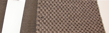
floor cover
In terms of the colour palette for the interior of the home it made sense to use a natural stone coloured hue for the walls and the client was offered a choice between Porters Himalaya which has a slight green undertone and Icelandic Stone which is very similar but slighter lighter and warmer
.
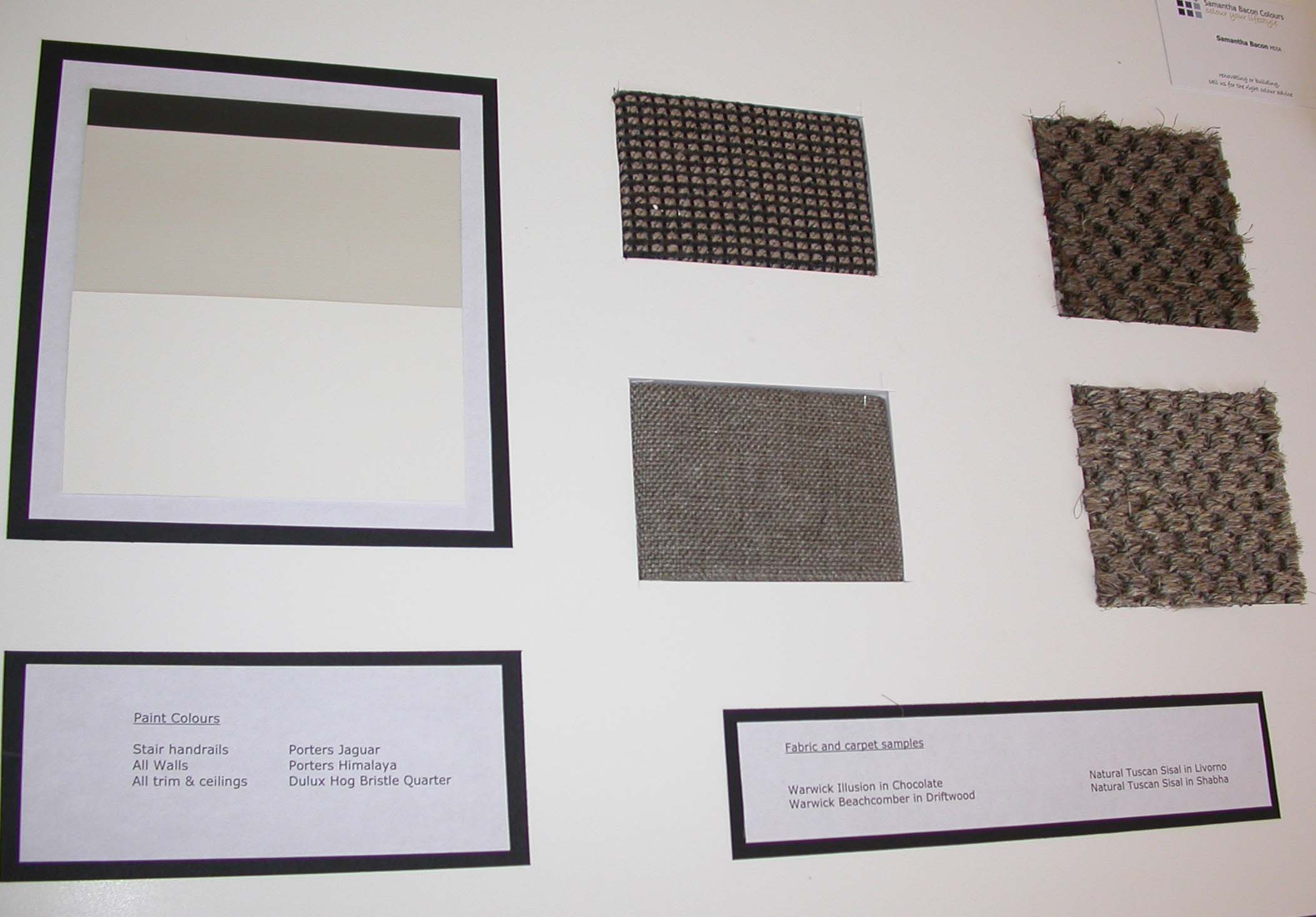
story board (tip: move your mouse over the image to magnify it)
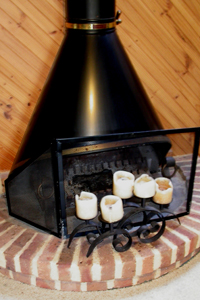
fire place
These colours are great neutrals, quite similar to the exterior wall colour and as parts of the exterior can be seen from inside this was also a good way to link the two together. Dulux Hog Bristle in quarter strength worked well with these colours for the trim, doors and ceiling as it provided a nice sharp contrast to the wall colour. It is essential for a natural palette to use paint finishes which are as matt as possible, particularly for internal doors as a high gloss finish would detract from the simplicity of the natural scheme.
When decorating with any neutral palette it is important to provide strong tonal variation to ensure that the scheme is not too bland. A centrepiece in the living room was a wood fire with an exposed flue reaching up to the ceiling in a strong black. To tie this into the scheme a fabric was chosen for the window pelmets which incorporates a rich chocolate black and a soft stone colour. These pelmets are designed to hide the cedar venetian blinds which are raised when the clients are in residence. It was also recommended to paint the stair handrails in Porters Jaguar which is almost black as again this provides good tonal variation and links well to the fireplace and pelmets.
About the author
Samantha Bacon designs unique colour schemes for interiors and exteriors of residential and commercial properties and is a colour feature and trends writer for Country Home Ideas and Modern Home magazines. She has assembled an impressive portfolio of work in Sydney, the Central Coast and Hunter Valley. Samantha specifies the colour, product and finish for every aspect of a renovation or new build.