An introduction to selecting paint colours
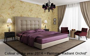 Why can some people pick the right colours and and others can't? The answer is simple, they have not read this article and learned the rules!
Luckily the rules for choosing paint colours are not that complicated, so let's get started. First we explain some basic terms and concepts and then we explain and illustrate our colour selection rules.
Paint colour: Basic terms and concepts
Primary, secondary and tertiary colours
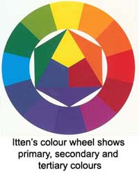
There are only 3 primary colours to choose from: red, blue and yellow. The word "primary" is used to describe these colours because they can not be mixed from other colours.
The colour wheel on the right shows how the three primary colours can be mixed to produce the 3 secondary colours: orange, green and purple (also called violet). The word "secondary" is used to describe the fact that these colours are the result of mixing two primary colours.
Mix a primary and a secondary colour and the results is a tertiary colour. These have "imaginative" names like red-orange, yellow-orange, blue-green, etc. Exciting stuff. Thankfully nobody talks about "quadratic colours"; because once you mix in another colour, you always get brown!

Complementary and split complementary colours
Complementary colours look great when used together in the right proportions. Complimentary colours make each other seem brighter. Complementary colours appear on opposite sides of the colour wheel. Split complementary refers to the use of the colours that border the complementary colour. For example if your primary colour is going to be violet, then the complementary colour is yellow. The split-complementary colours are green and orange.
The four dimensions of colour: hue, value, intensity & temperature
Hue: Hue is another name for colour, or, if you want to get technical, hue is: "The attribute of colours that permits them to be classed as red, yellow, green, blue, or an intermediate between any contiguous pair of these colours" (Merriam Webster Dictionary), or: "A hue is an element of the colour wheel" (Wikipedia). Tonality is the dominance in a room (or in a picture, scenic outdoor setting, etc.) of a particular hue or colour. Broken hues (or broken colours) are an unequal combination of primary colours.
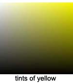
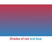
Value or tint: Simply the lightness or darkness of a colour (how much black and/or white it has in it). The resulting colour is called a tint. This is different from a shade which is a dull colour resulting from the mix of a pure colour with its complementary colour. Note: Unfortunately these terms are overloaded; many sources refer to a tint as "colour + white", a shade as "colour + black" and tone as "colour + grey".
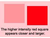
Intensity or saturation: Vividness of hue or colour; degree of difference from a grey of the same lightness or brightness. Neutral colours have low saturation. All pure colours or hues are fully saturated. Painting an object with a high intensity colour will make that object appear larger and it pushes the object forward in the visual field.
Temperature: Temperature refers to the warmth or coolness of a colour. Research has shown that certain colours stimulate us and increase our temperature slightly, and some colours relax us and decrease our temperature. Warm hues are yellow, yellow-orange, red-orange, red and red-violet. The cool hues are yellow-green, blue-green, blue and blue-violet; in other words, they are usually related to blue, with the coolest being blue-green. Using a warm colour, like a warm white in a bathroom, will make the space seem warmer. Note: different types of lighting also effect the apparent temperature of a colour; e.g. dim lighting will make reds, yellows and oranges seem warmer.
Colour schemes
There are 3 colour schemes that you can choose from. They are:
- Monochromatic: This is the most commonly used paint colour scheme used by interior designers. Most spaces are painted using a single neutral colour.
- Analogous: If you choose 2 or 3 paint colours next to each other on the colour wheel you have an analogous colour scheme.
- Complimentary: As mentioned above complementary colours look great together in the right proportions. Making use of this fact when painting and decorating a home is referred to as using a complementary colour scheme.
